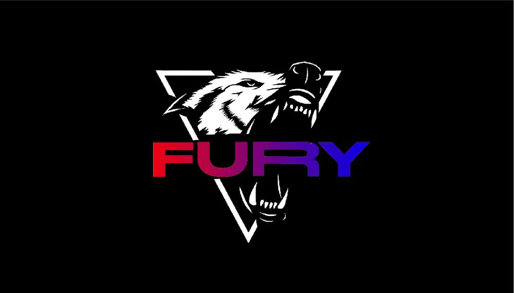
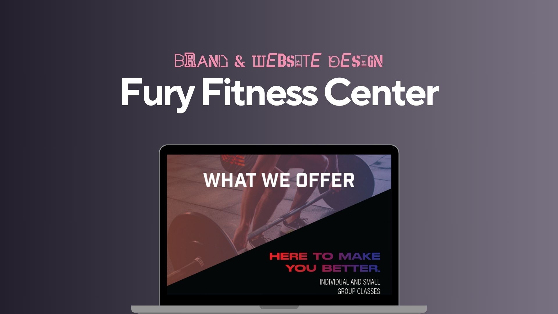
Fury Fitness Center Logo and Website Design
Fury Fitness is a small startup gym launched by a personal trainer looking to build a brand that reflects his intense, no-excuses training philosophy. As part of a college class project, I was tasked with creating the foundational branding and web presence for the business. The client wanted a visual identity that could reflect both his personal brand and appeal to a clientele ready to commit to serious fitness transformations.
My role was to deliver a logo suite, typography and color system, and an interactive website prototype. The project needed to communicate strength and discipline while remaining approachable and usable to a general audience. With tight class deadlines and a self-directed creative process, I was responsible for managing all aspects of the project from initial discovery through final design.
Client
Fury Fitness Center
Service Provided
Primary Logo Design, Website Design and Build, SEO Setup, Branding Guide, Social Media Graphics, Print Collateral (Flyers and TV Menu Board Graphics)

The Process
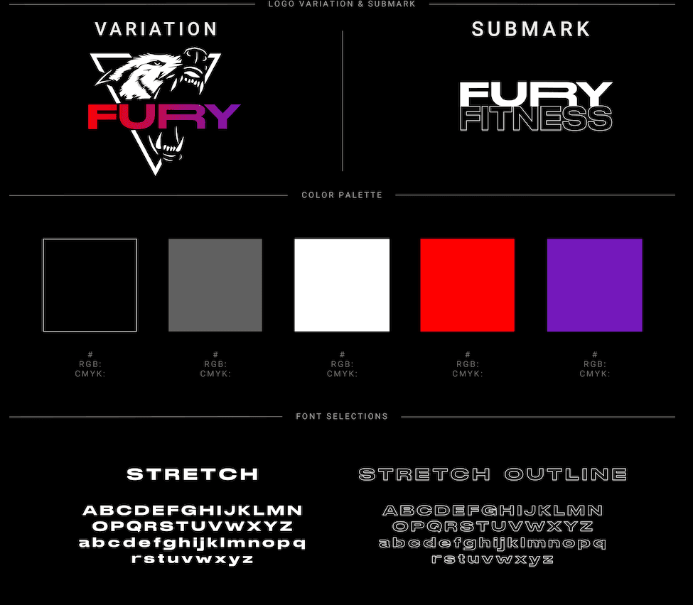
The logo design process began with a wordmark that mimicked the structure of bold gym logos but with a unique typographic twist. I customized the letters to reflect movement and force, creating a sense of tension and control. The final result included a primary logo, submark, and icon. On the web side, I designed a homepage and interior page, including About, Services, and Contact sections. The layout used a bold hero image with call-to-action buttons, followed by services provided and a contact form. Each section was designed to walk a new visitor through a conversion flow, from interest to contacting. I made the site easy to scan while reinforcing the boldness of the brand with visual rhythm and contrast.
1
The Challenge
The core challenge was designing a brand that felt as intense as the training style but wouldn’t alienate newcomers. I had to strike a balance between hard-edged visuals and enough polish to make the brand feel credible and professional. Another challenge emerged in the form of evolving client expectations. Initially, we scoped out a logo and simple landing page, but as the project evolved, the client began requesting more than we agreed upon, more pages, added features, and branding add-ons. As a student still learning the ropes of client work, I struggled at first to push back. This ultimately became one of the most important learning moments of the project.
2
Research & Discovery
My research began with an audit of fitness branding trends, focusing particularly on independent gyms and personal trainers. I collected reference materials from major gym franchises and boutique studios to evaluate what made each stand out. Visual trends I observed included bold sans-serif typography, dark and saturated color palettes, and intense, high-contrast imagery. I experimented with color combinations that reflected both energy and approachability, opting for red, purple, and black to capture the high-intensity vibe while maintaining visual clarity. Typography played a big role: I explored sturdy, squared sans-serif fonts and paired them with rounded subheads to soften the tone just enough. This early experimentation helped guide the identity direction that felt both authentic to the client and professional in presentation.
3
Final Deliverables
Final deliverables include: - A full logo suite (primary logo, icon, wordmark variations) - Typography and color system - Website homepage and what we offer page - Desktop and mobile layouts - Brand guide PDF with logo usage and style references These were presented as a live website and a final brand guide for the client to use moving forward. Alongside files ready to print for the services flyer and business cards.
4
Outcome & Results
The client responded positively to the final brand, noting that it made the gym feel "real" and professional. He began using the logo and branding elements across social media platforms, local print materials, and business cards. Even though this was a class project, it was real in scope and stakes. The identity gave the client a visual foundation to grow from, and the website gave him a vision of how to communicate his story online.
5
Reflection
This project taught me how to set a project scope and identify scope creep with clients. It was a free project, and because of this, and the nature of starting a small business, the client attempted to get additional work without additional compensation. This experience taught me how to advocate for myself and set boundaries with clients. I learned the importance of defining project parameters and deliverables clearly from the outset and reinforcing those boundaries when necessary. Strong communication and clear expectations would have helped avoid misunderstandings. If I could do this project again—now six years later—I would have laid out a project timeline and deliverables from the beginning. Clearer communication and documentation would have made this project smoother and more sustainable. From a creative standpoint, I would also make different design choices now that my skills have matured and my design eye is more refined.
6
Recent Designs