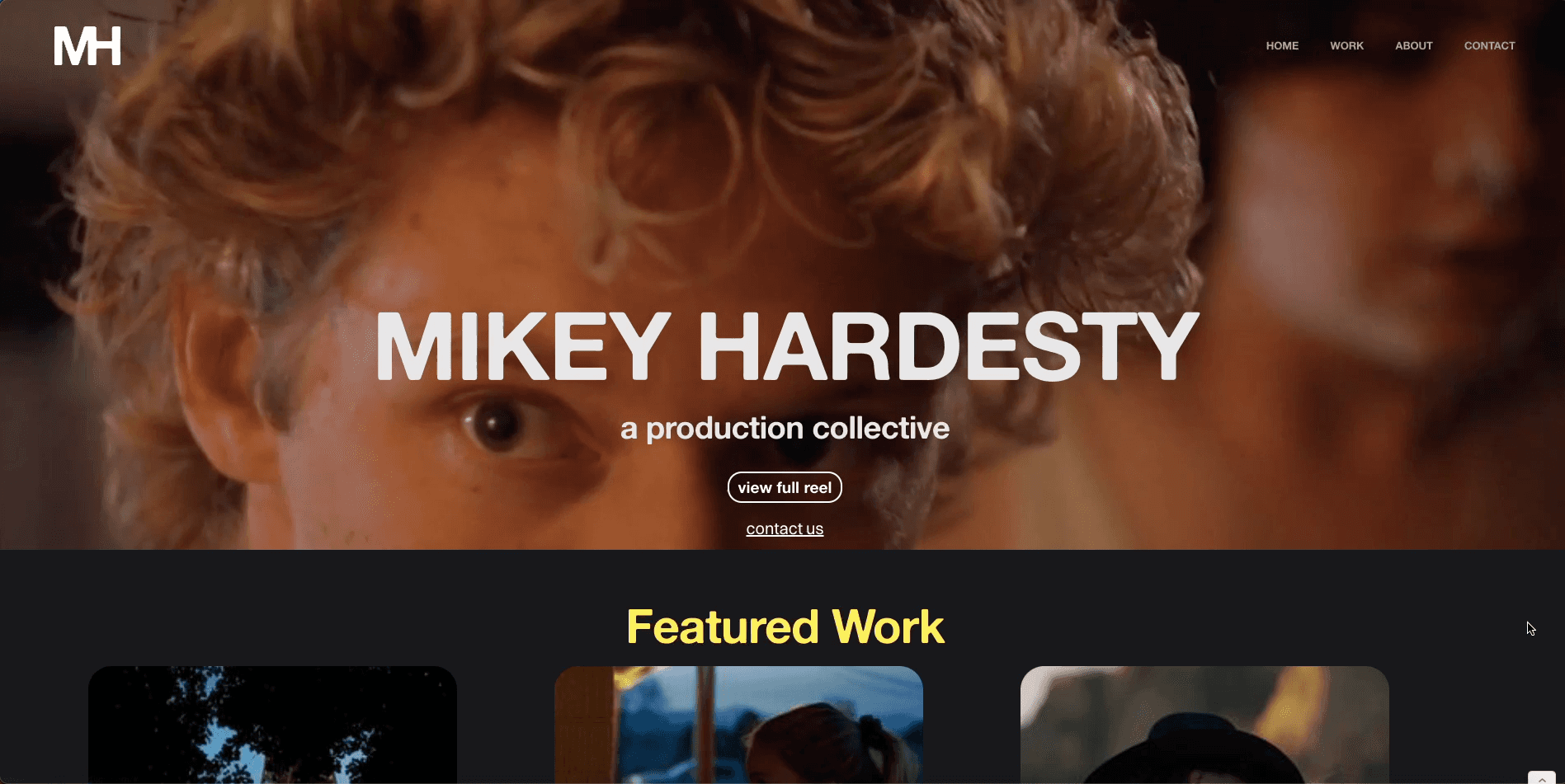
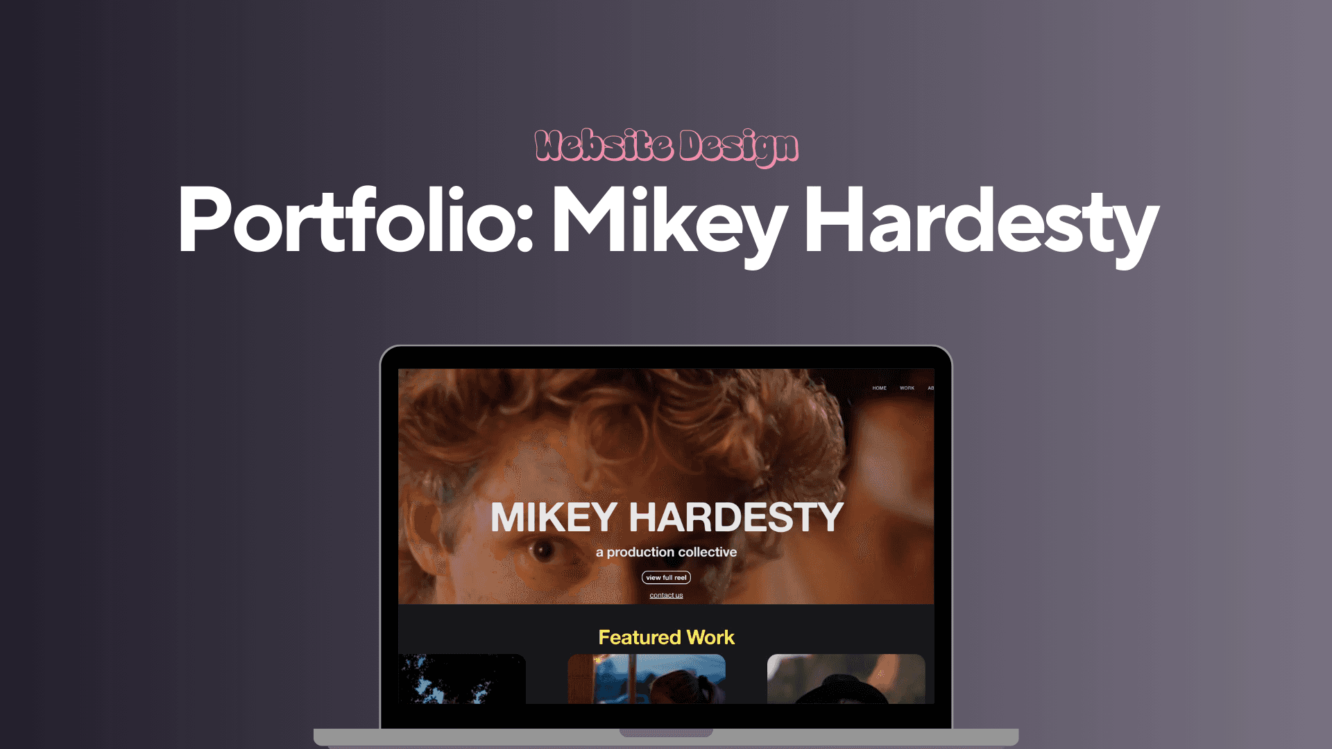
Mikey Hardesty Film Portfolio Website Design
Mikey Hardesty, a film director and cinematographer, needed a portfolio website and visual identity that could showcase his narrative work in a professional, elevated way. The goal was to create a streamlined, cinematic web experience that made his films the focal point. In addition to the website, Mikey needed a modern, understated logo to represent his name and work across digital and printed materials.
I was responsible for developing the visual identity, designing and building the website in Webflow, and guiding creative direction throughout the project. We worked collaboratively to define what felt most like "him," refining colors, layout, and design elements to align with his taste and audience.
Client
Mikey Hardesty
Service Provided
Website Design and Development (Webflow CMS), SEO Optimization, Branding Enhancements, Content Editing, Logo Suite
The Process
We started with visual identity sketches and logo drafts, experimenting with type-based designs that hinted at editorial and filmic sensibilities. Once the logo direction was selected, I built a brand guide with type hierarchy, color palette, and motion references. The website followed with a wireframe-first approach. We prioritized video layout, intuitive navigation, and a smooth user experience. Using Figma, I mapped out the homepage, work pages, and about/contact sections. Mikey provided all of the video assets, which I optimized for fast playback and mobile responsiveness before implementing the full build in Webflow. Animations were kept minimal, just enough to add polish without overwhelming the user. I also included accessibility considerations, such as alt text for thumbnails, clear headings, and legible contrast. We tested the site together across devices to make sure everything functioned as intended.
1

The Challenge
The primary challenge was translating Mikey's cinematic eye and storytelling approach into a cohesive digital experience that felt both personal and professional. His previous portfolio lacked clarity and didn't effectively communicate the breadth or depth of his work. We needed to build a space that could house his films, reflect his aesthetic, and position him for continued growth in the industry. Another challenge was balancing artistic expression with usability. The site needed to load quickly, display high-quality video work, and be responsive across devices without compromising the design integrity. We also needed a logo that felt subtle yet distinctive enough to live on its own without distracting from the visual content.
2

Research & Discovery
I began the project by analyzing websites from other filmmakers, cinematographers, and production companies to understand common layouts, UX patterns, and brand aesthetics. We looked at award-winning portfolio sites to get inspired by how others curated and framed their work. Through direct conversations with Mikey, I learned about his values as a storyteller, the kind of projects he wants to attract, and what makes his work unique. He emphasized subtlety, mood, and emotion, qualities we wanted to express visually through typography, color, and minimal design. This discovery phase helped us identify core design principles to guide every decision moving forward.
3

The Goal:
The final deliverables included: - Primary logo design and brand identity system - Responsive Webflow website with optimized video embeds - Typography and color style guide - Social and presentation-ready logo files What I’m especially proud of is how seamlessly the site feels like an extension of Mikey's personality and creative tone. The restraint in design allowed his work to be the hero, while still providing a recognizable visual signature. It was rewarding to create something he felt proud to send to industry contacts and potential collaborators.
4
Outcome & Results
Mikey immediately launched the site upon completion and shared it with peers and potential clients. The response was overwhelmingly positive, with feedback emphasizing the professional feel and clarity of the work showcase. Several of his connections in the film industry mentioned how clean and cinematic the site felt, exactly what we had set out to achieve. He also received new inquiries for both cinematography and directing work shortly after sharing the new site, showing early signs that the refreshed brand and platform helped elevate his market positioning. It gave him confidence in how he presents himself professionally.
5
Reflection
This project deepened my appreciation for restraint in design and the importance of letting content lead. It also sharpened my ability to translate a creative personality into a digital brand. Working directly with a visual storyteller challenged me to think in terms of tone, pacing, and flow, skills that are valuable for future portfolio or creative direction projects. If I were to revisit this project, I might expand the site into a CMS-driven build to allow for easier film uploads and updates over time. That said, the static build served the project's timeline and purpose well, and I learned a lot from the collaborative process.
6
Recent Designs