PartnerVista Logo Suite Design
PartnerVista is a B2B marketing software company seeking a cohesive visual identity that reflects the unique strengths and personalities of its two founders while resonating strongly with their ideal audience. As the freelance designer on this 12-week project, I was responsible for developing the full brand identity from concept through multiple iterations using Adobe Illustrator.
The goal was to create a unified and versatile design system that merged the founders’ visions into a single, compelling brand voice and visual language that would support all future marketing and product materials.
Client
PartnerVista
Service Provided
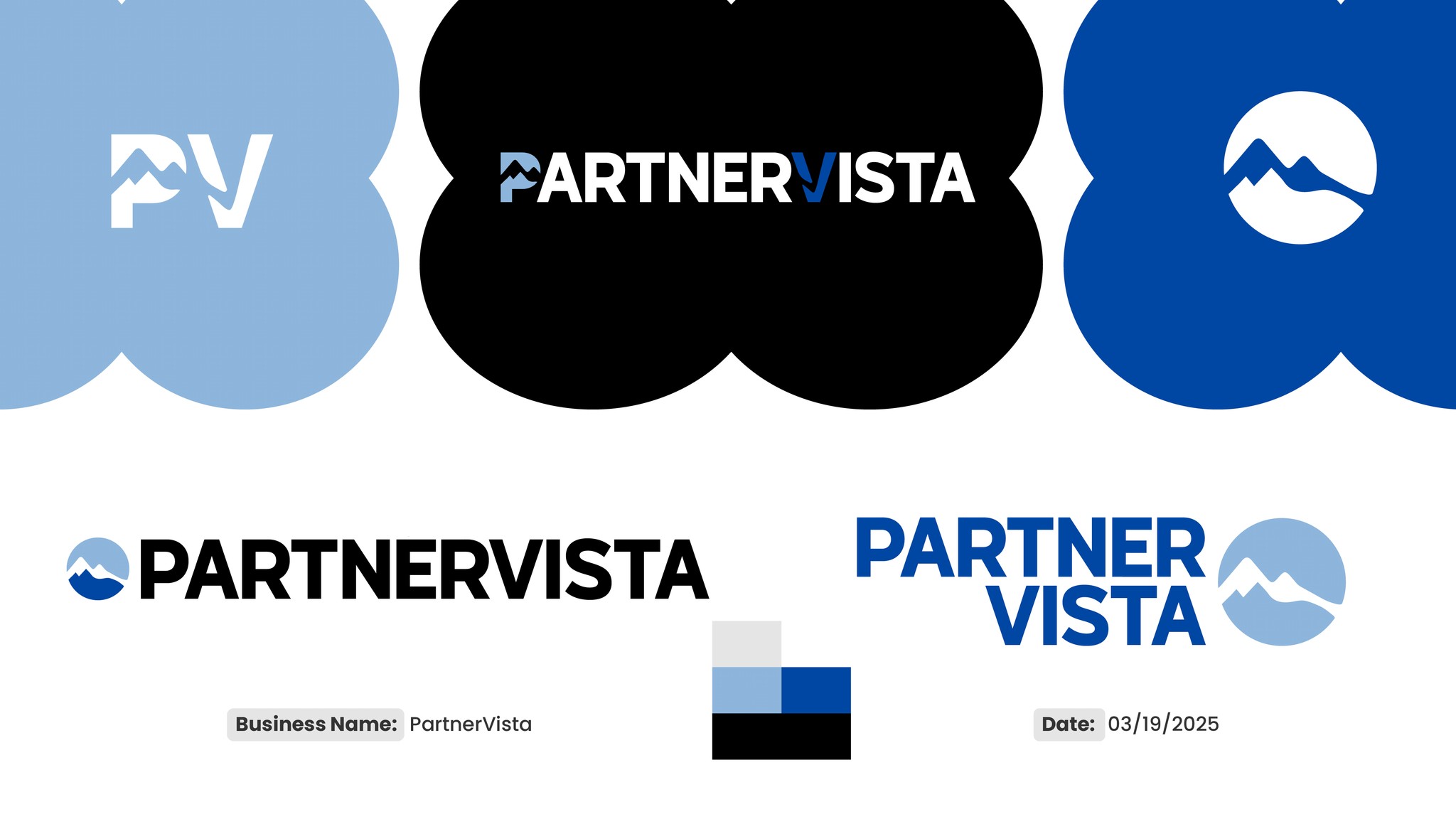
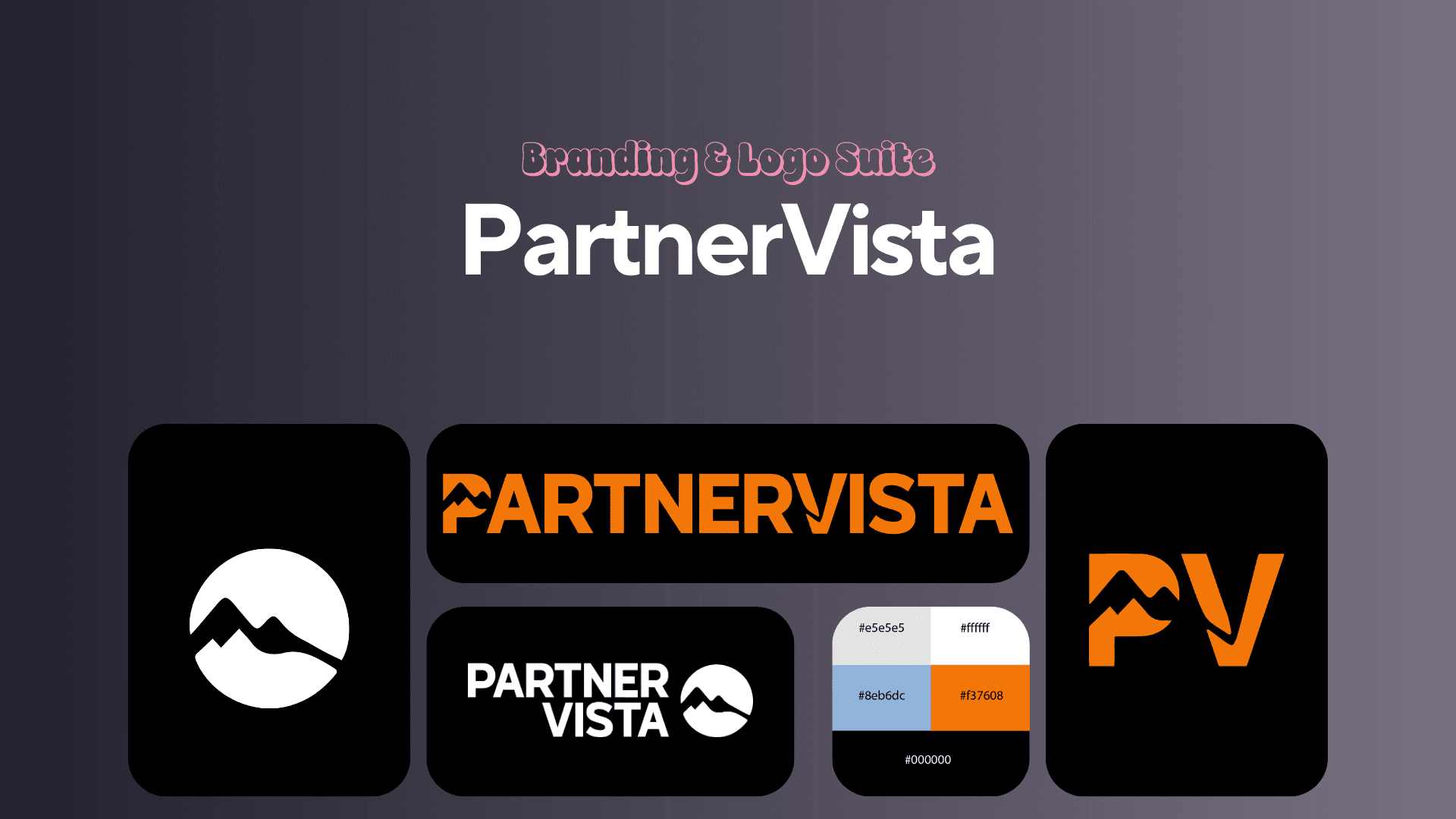
Primary Logo Design, Secondary Logo Variations, Logo Marks, Basic Brand Guide
The Process
From the initial moodboards, I focused on aligning the founders’ emotional responses with their strategic goals for the brand. Each iteration involved collaborative meetings where I made live adjustments based on their feedback, stretching and refining concepts to better capture their vision. To communicate unity and symbolize the founders’ transition from California to Colorado, I emphasized flow between design elements and strategically used negative space. This approach visually represented partnership and growth while maintaining a modern, clean aesthetic. We completed three rounds of iterations. During feedback sessions, I guided the conversation with targeted questions about specific elements and design choices to ensure clarity and actionable input for each next step. Beyond the logo and core identity, I developed a cohesive color palette and print collateral assets, ensuring the brand could be applied consistently across various mediums and touchpoints.
1

The Challenge
The founders of PartnerVista had recently relocated from California to Colorado and wanted their brand identity to reflect this significant transition while visually expressing unity and partnership. Capturing both their personal journeys and collaborative vision in one cohesive design was essential to differentiate their brand and build authentic connections with their target audience. This was a challenge worth solving because the founders hired me to translate these complex, intertwined themes into a modern, clean brand identity that would resonate in the competitive tech space. Their success depended on a visual system that not only felt genuine to them but also performed well across digital platforms and marketing materials. My main goals for the brand identity were to embody the founders’ values of unity and growth, highlight their fresh start in Colorado, and deliver a versatile design that supported their business ambitions with clarity and professionalism.
2

Research & Discovery
To fully understand PartnerVista’s vision and the unique story behind their brand, I began with an initial discovery call, an essential step in my process for all clients. This conversation helped clarify the founders’ goals, values, and personal journeys, which became foundational to the brand identity. I also researched competitor brands and the tech giants that make up PartnerVista’s target client base, such as Google, Amazon, and Microsoft. These companies share a clean, modern design language that communicates professionalism and trust, qualities I aimed to echo while ensuring PartnerVista’s identity stood out with its own unique voice. To explore different creative directions, I developed several moodboards presenting diverse concepts. These visual explorations helped the founders connect emotionally with potential aesthetics and guided the subsequent design phases.
3

Final Deliverables
The final deliverables for PartnerVista included a complete brand identity system: logo files in multiple formats, a refined color palette, brand guidelines, and a suite of print collateral to support their business launch. A standout feature of the logo is the intentional use of negative space to subtly represent the transition from ocean to mountain, symbolizing the founders’ move from California to Colorado. This design solution brought personal meaning to the visual identity without compromising its sleek, professional appeal in the tech space.
4
Outcome & Results
The PartnerVista brand identity was received with enthusiasm. The clients loved the final design and immediately began using it across their materials as they launched their company. The most affirming feedback I received was how much they enjoyed the collaborative process—and their eagerness to work with me again on future design projects.
5
Reflection
This freelance branding project was a valuable milestone in my professional development. It strengthened my ability to lead guided review sessions with clients, helping them provide more useful feedback early in the process and ultimately reducing the number of iterations. It also sharpened my ability to bridge personal storytelling and clean, scalable visual systems, an essential skill when building identities that are both meaningful and functional.
6
Recent Designs