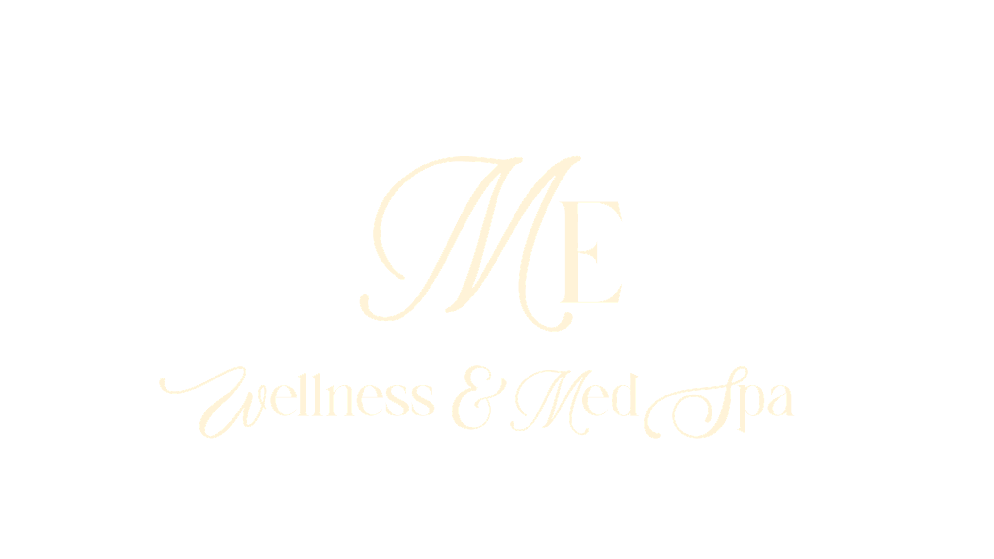
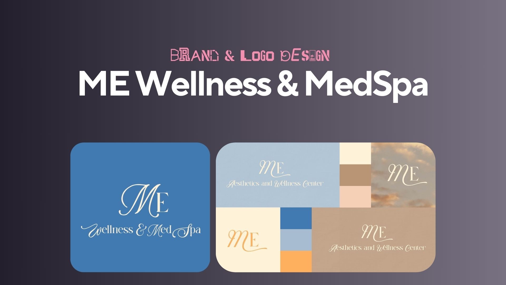
ME Wellness & MedSpa Brand Identity
ME Aesthetics & MedSpa is a new beauty and wellness studio offering services like Botox, lip filler, and IV therapy. The founder hired me as a freelance designer to build the complete brand identity suite from the ground up. This included the logo system, color palette, typography, and presentation materials for launch.
The goal was to create a clean and luxurious brand that would appeal to women ages 25–60 looking for modern, trustworthy medspa treatments. Over two weeks, I developed a visual direction, presented multiple rounds of logo exploration, and delivered a polished brand suite ready for immediate use. All assets were created in Illustrator and assembled into a Canva presentation deck for launch.
Client
ME Wellness & MedSpa
Service Provided
Primary Logo Design, Logo Mark Creation, Brand Color Palette, Signage Design, Patient Care Card Design

The Process
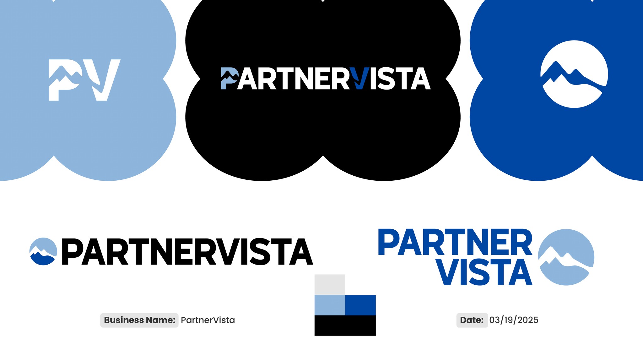
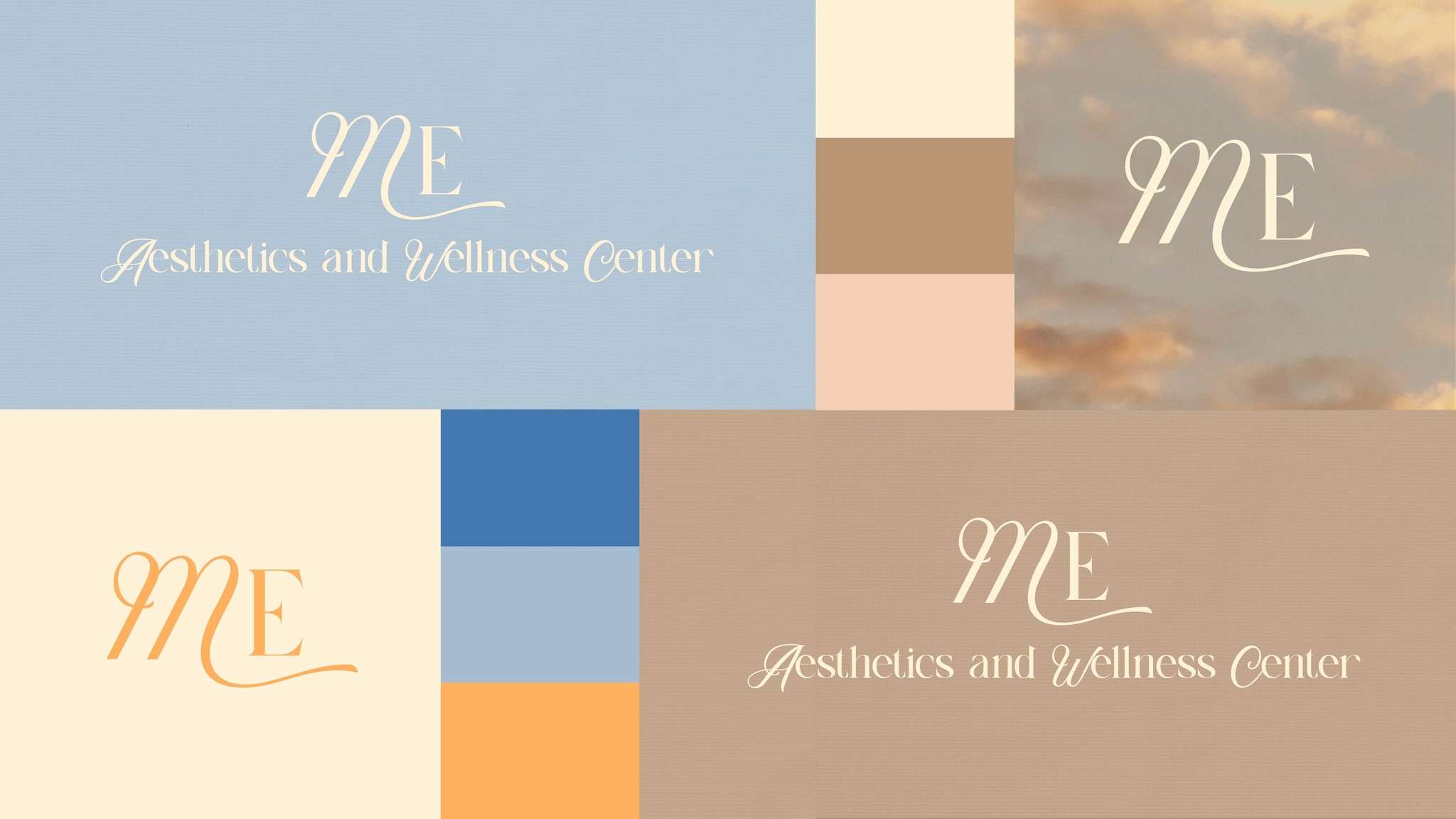
After locking in the moodboard, I moved into logo exploration. Because the name “ME” was rooted in the founder’s identity, the mark had to feel personal, refined, and instantly recognizable. We went through three rounds of logo concepts, focusing primarily on how the “M” could be styled to balance elegance with simplicity. The client responded strongly to a version of the “M” that felt soft yet structured, and we refined it over multiple iterations. Once the logo direction was finalized, I built out the rest of the brand system, choosing a calming and modern serif for headings, pairing it with a clean sans serif for body copy, and finalizing a warm, neutral color palette that felt clean but not clinical. The entire suite was packaged in a Canva presentation deck so the client could easily reference and apply the assets across digital and print.
1
The Challenge
The client needed a brand that communicated both professionalism and warmth—a balance between medical credibility and cosmetic appeal. While competitors in the area leaned heavily into cold clinical aesthetics or dated color choices, ME Aesthetics needed to stand out as clean, modern, and calming. This was especially important given the founder’s target audience: women seeking aesthetic treatments who wanted to feel confident and cared for. The challenge was creating a look that evoked trust and sophistication without feeling generic or sterile.
2
Research & Discovery
To understand the visual landscape, I reviewed direct competitors in the local medspa space and found a consistent lack of refinement in both branding and web presence. This opened the opportunity to position ME Aesthetics as a more intentional and elevated brand. I created two distinct moodboards to explore tone and visual direction. After presenting both to the client, we aligned on a clean and luxurious aesthetic with soft, feminine undertones. We ended up blending elements from both moodboards, pulling an accent color from one and the core palette and type direction from the other. This collaborative process set a strong foundation for what the brand would become.
3
Final Deliverables
Final deliverables included: - Primary and alternate logos - Custom monogram mark - Full brand color palette - Typeface pairings and usage guide What I’m especially proud of is the cohesiveness of the final suite, the monogram, color palette, and typography all work together to create a brand that feels both calm and elevated. The visual system communicates the founder’s professionalism while still feeling personal and warm, which was essential for standing out in a saturated market. Seeing how confident the client felt when launching with these assets affirmed that the design did exactly what it needed to do.
4
Outcome & Results
The client loved the final brand and implemented it into production immediately. She launched her medspa’s social media and marketing materials using the new visuals and felt that the design perfectly captured the experience she wanted to offer. The clear, calming, and elevated identity gave her confidence in launching her business and stood out instantly from competitors.
5
Reflection
This project taught me the power of leading clients with intention. I realized how important it is not just to design something beautiful, but to explain the strategy behind the choices. Especially with clients who aren’t used to working in the creative space, guidance and clarity go a long way. I also saw firsthand how presenting a strong rationale helps clients feel confident in making decisions. This was one of the smoothest branding processes I’ve worked on, and it reinforced how clear communication, thoughtful direction, and understanding your client’s vision can lead to fast, effective, and meaningful results.
6
Recent Designs