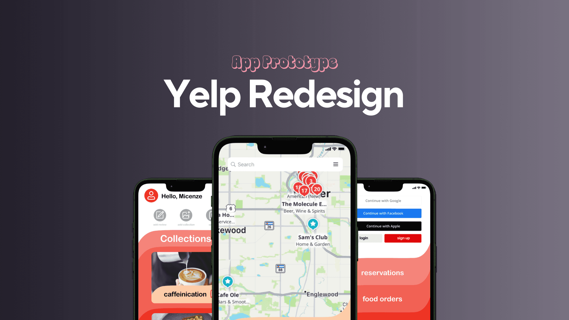
Yelp App Redesign
In my Interactive Systems class, my team and I took on a full redesign of the Yelp mobile app, focusing on improving clarity, usability, and visual hierarchy. Although Yelp is a globally recognized platform, its native app has long suffered from a cluttered interface, inconsistent navigation patterns, and overwhelming content prioritization. Most users access Yelp through search engines or integrations like Google Maps—rarely through the app itself.
Our goal was to reimagine the app as a tool users would want to download and use directly. Over 8 weeks, we performed a UX audit, mapped core user flows, designed new UI systems, and developed a polished prototype using Figma and Sketch. I led the prototyping, contributed to the UX analysis, and helped unify the visual direction across the team.
Client
Interactive Design Class Project
Service Provided
UX Audit, Empathy Mapping, User Persona Creation, Wireframing, UI Redesign, Interactive Figma Prototyping, Presentation Materials
The Process
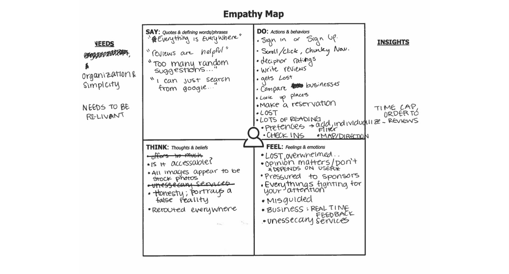
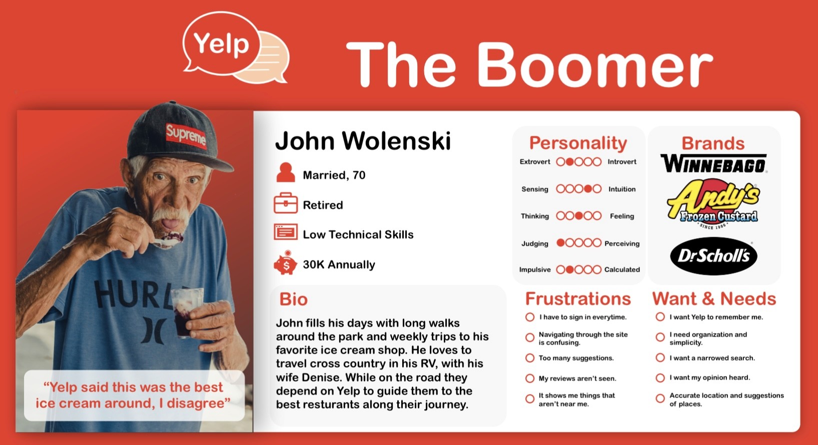
Our design process was rooted in collaboration, communication, and iteration. We began by translating our research findings into actionable outputs, creating user personas, mapping user journeys, and drafting user flows. From there, we wireframed key screens, tested our early layouts, and refined the experience based on user feedback. Each stage involved continuous testing and validation to ensure the design remained grounded in user needs. I led the creation of our user personas and crafted most of the final Figma screens, including interface animations and an interactive prototype. I also redesigned the Yelp logo to better reflect the updated visual system and brand direction. This project was an ideal model of teamwork. Thanks to a well-outlined framework from our professor, we were able to assign tasks effectively, stay aligned, and deliver everything on time. Each person contributed consistently throughout the process, which made the redesign stronger and more refined with every iteration. Visually, we wanted the new Yelp brand to reflect the app’s core purpose, helping people share and discover local experiences. We kept the original red but introduced two new accent colors to diversify the visual hierarchy. We also used the message bubble shape as a motif across screens and UI elements to tie the experience together and reinforce the conversational nature of reviews and discovery.
1
The Challenge:
Despite being a well-known and widely used platform, the Yelp mobile app presents a surprisingly frustrating user experience. During our initial audit, we found the navigation bar to be functionally weak and the overall flow of the app to be unintuitive. Important features were buried, screen layouts were cluttered, and the visual design lacked the polish expected of a global platform. This was a problem worth solving. Yelp plays a major role in helping people discover and evaluate local businesses and yet, most users rely on integrations through platforms like Google rather than using the app itself. We believed the app should offer enough value and usability to stand on its own. Our redesign set out to address these issues by improving the app’s core navigation, simplifying search and filtering, and creating a more visually appealing, streamlined experience. Our goal was to make Yelp not just functional—but delightful and worth downloading.
2
Research & Discovery
To inform our redesign, we conducted comprehensive user research that included surveys, interviews, and usability testing. We also observed how users interacted with the current Yelp app, where they got confused, what they expected to find, and how long it took them to complete common tasks. This data helped us identify key friction points and validate our design decisions. We created user personas and mapped out goals and frustrations based on this feedback. Our UX audit of the existing app confirmed what our testing had shown: the bottom navigation bar lacked purpose, key features were either buried or inconsistently placed, and overall, the experience was overwhelming and directionless. We also examined competitor apps, such as Google Maps, OpenTable, and Apple Maps, to study how they structured navigation and presented local business content. The biggest takeaway? These platforms had a clear sense of who they were speaking to, while Yelp’s app felt scattered, outdated, and difficult to engage with. This combination of research and competitive analysis grounded our redesign process in user behavior, not just visual preferences.
3
Final Deliverables
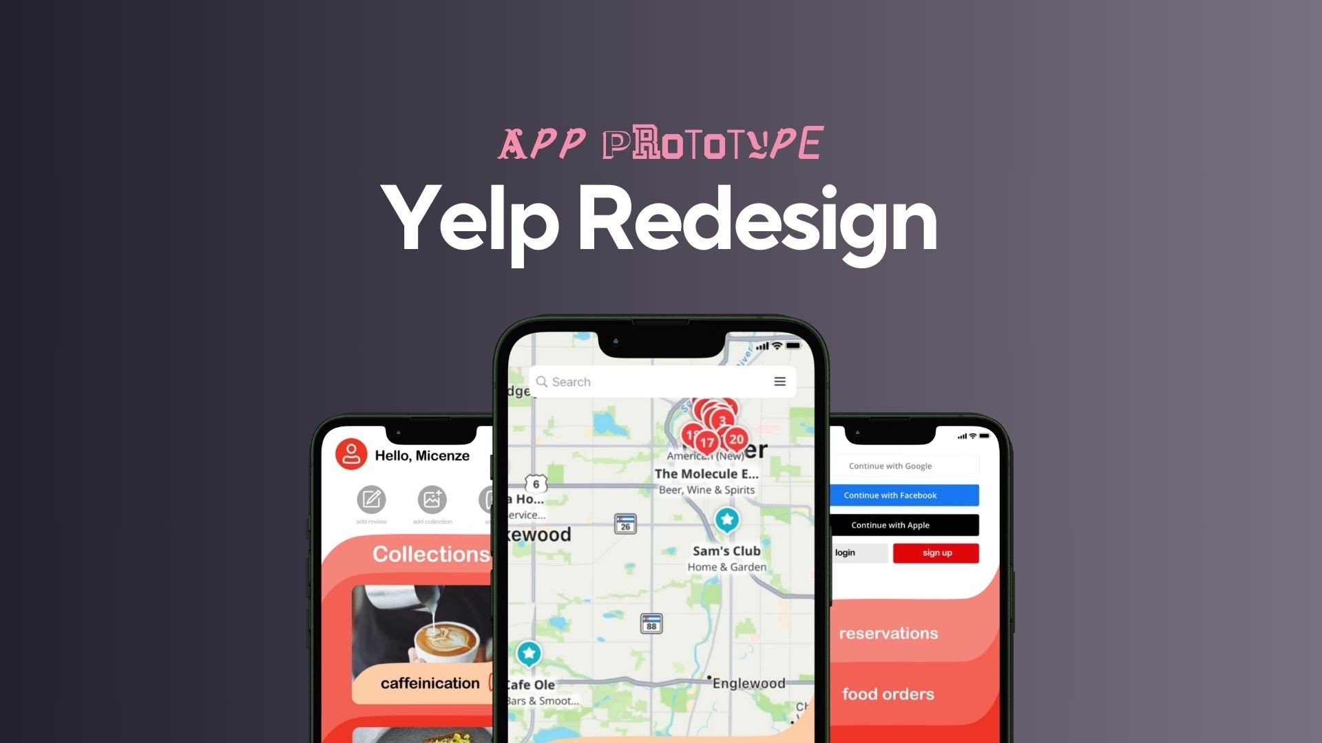
By the end of the 8-week redesign, our team delivered a fully reimagined Yelp app experience, complete with interactive screens, new branding, and documentation supporting our research and design rationale. Final deliverables included: - A high-fidelity interactive prototype used for user testing and presentation - Redesigned logo and expanded brand system - UI kit with updated components and iconography - User personas and research documentation - Interactive animations embedded in the prototype - A full presentation deck explaining our design decisions and process I’m especially proud of the redesigned menu and navigation system, which directly addressed the usability challenges we identified early in the process. I’m also proud of how consistent and cohesive the new branding felt across every screen, especially considering this was my first-ever app prototype in Figma. Learning how to create in-app animations and build a functional prototype from scratch was a huge milestone for me as a designer.
4
Outcome & Results
Our Yelp redesign was received very positively by both our professor and classmates. The improvements to usability, branding, and interaction flow were clear and well-articulated, and our team received encouraging feedback on the consistency and completeness of the work. While we didn’t receive much constructive critique, the response affirmed that our solutions addressed key user pain points and made the app experience feel more intuitive and modern. My biggest takeaway from this project was learning how to successfully organize and contribute to a team-based design process. From setting expectations to sharing responsibilities and aligning on a vision, this project gave me foundational experience in collaborative UX/UI work, skills that have directly impacted how I lead and structure future group projects.
5
Reflection
This project marked a major turning point in my growth as a UX/UI designer. Not only was it my first time using Figma and building an interactive app prototype, but it also gave me a hands-on opportunity to develop animations, build consistent branding, and collaborate on a multi-phase redesign from research to delivery. One of the most valuable parts of this experience was learning how to work within a design team. The project taught me how to divide responsibilities, align on visual direction, and keep the process structured without losing creativity. Seeing how each person’s contributions came together to form a complete, well-received product gave me a huge boost in confidence and clarity about how I approach design collaboration today. Overall, this project gave me the tools and the trust in myself to move forward as a capable, research-driven designer who can take an idea from audit to polished prototype.
6
Recent Designs